New Website
| 5 minutes readThis morning I launched my new website. I used to be one of those designers that never reserved time for my brand, only working for clients and never on myself. As a result, I’ve never been really proud of my site.
I need to go back in history to my first portfolio site, that I superstitiously launch on September 9th, 2009 (09/09/09) looking for a bit of luck, raining clients or some kind of help. I didn’t go by my name back then, it was popular to create a business name and giving the impression that you were more than one, “sounds more professional” I use to think.
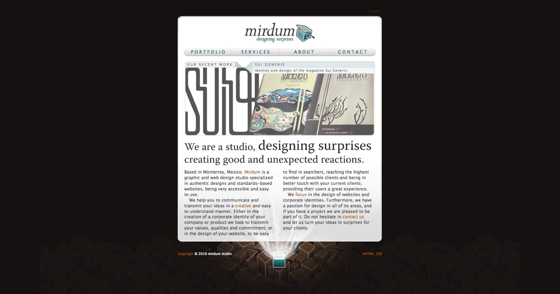
Mirdum was the name of my one person studio, some things are broken but you can see my early work when I was starting, I haven’t changed a thing since 2009 so is very outdated, using Strict XHTML was what the cool kids were using, before HTML5, I build it on WordPress with custom fields and some cool plugins so it can be flexible and easy to update. It wasn’t.
When I tried to add a new workpiece I found myself losing a lot of time to post it, that and the “build it and they will come” mentality didn’t help either. So I practically abandoned my site.
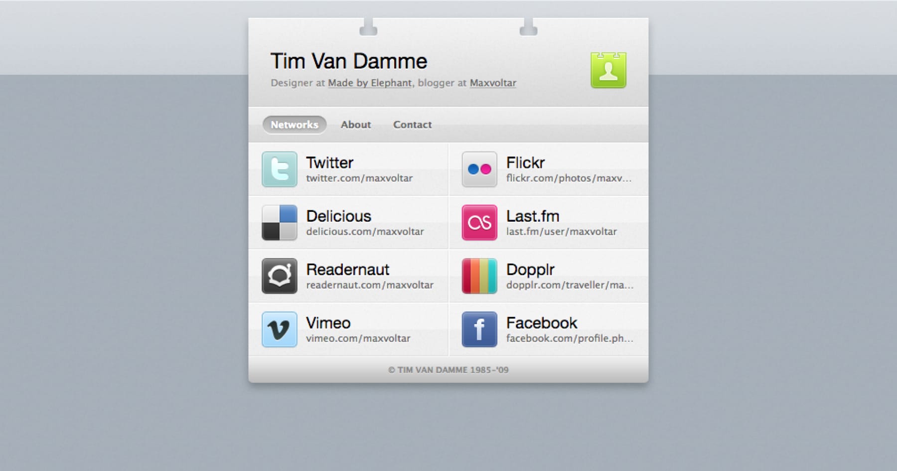
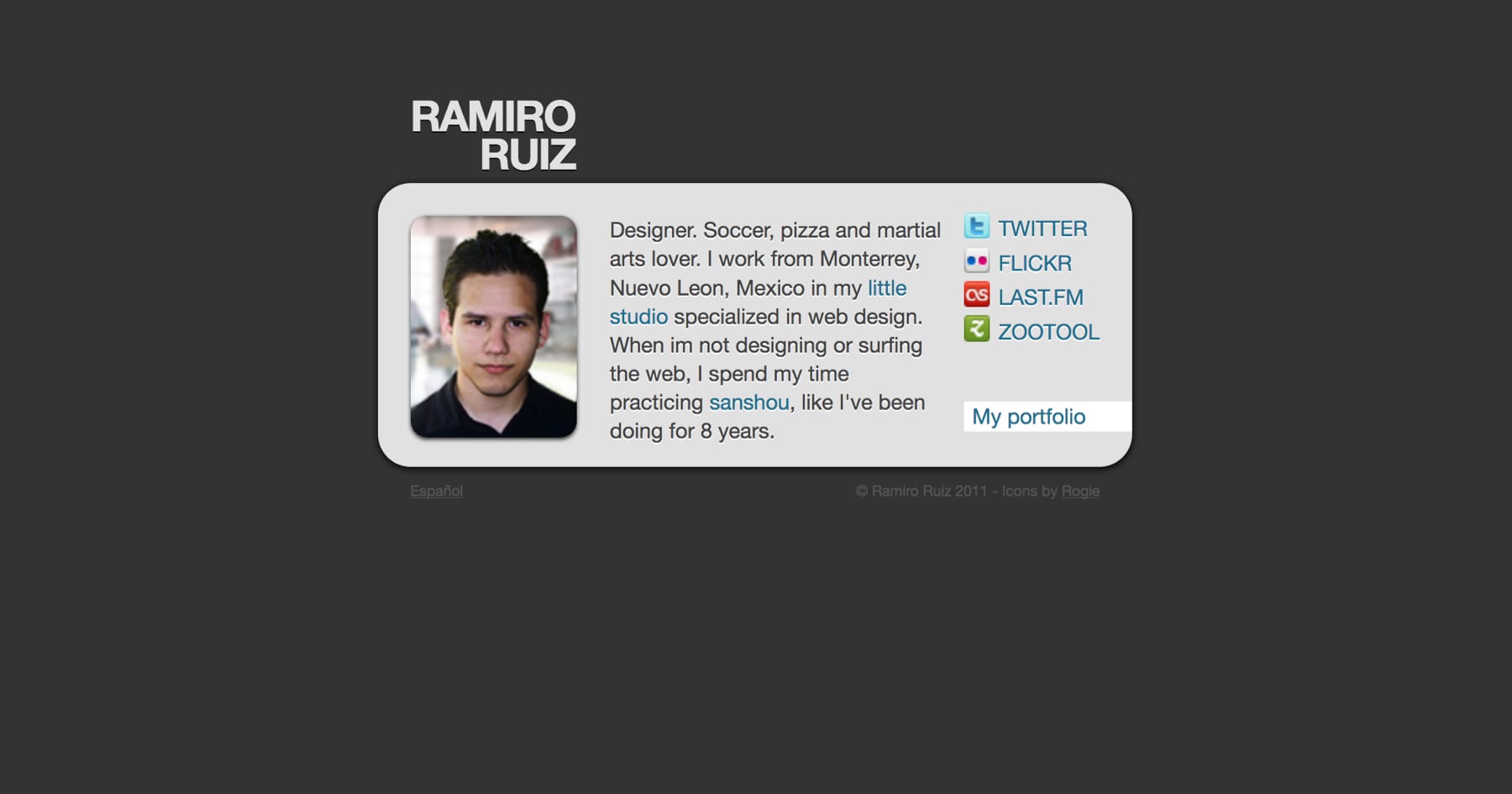
Then I bought ramiroruiz.com since it used to be owned by a gentleman in Brazil with the same name. That time I only wanted a business card or vCard website, Inspired by the awesome work of Tim Van Damme.
I use WordPress again, this time the multisite feature was pretty new so I created a bunch of experimental sites on that domain one of those was a personal blog. And despite my intentions to start a new habit of writing and creating more, I only got to publish once and end up abandoned it too.
New hope
Now, many years later I’m coming back more decided than ever. I certainly was motivated thanks to the big interest in static site generators and learning a bit about them. They are so flexible and simple, that’s what I’ve been looking for. I don’t need to setup databases, install dozens of plugins or update frequently to avoid exploits on my website.
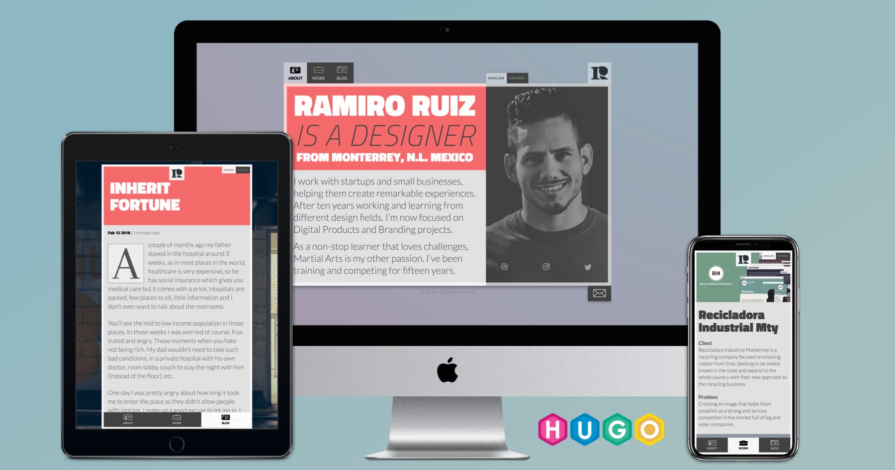
Once I was decided to build my new site on a static site generator I start researching about the top ones to help me decide on one. I end up choosing Hugo for their amazing speed and because it is relatively easy to learn, designer-friendly I would say.
Planning
I still like the basic principle of a vCard style, when I go to a personal website I’m looking for a fast way to learn more about, who they are?, what they do?, and where else can I find them?
So I focused on covering those questions right away, I write a one-page version of the homepage.
- Simple about info
- Social links
- Featured work
- Selected case studies list
- New blog post
- Recent posts list
I was looking for the speed of a one-page site by quickly having the main content but in a different format, I wanted a mobile app tab experience. So I made a horizontal list with the 3 key sections, where you can scroll/navigate with their hashtags links and also on mobile you can slide from one tab to another in the homepage thanks to Swiper, and the nav is on the bottom for easier access, maintaining a more native and natural feel.

Integrating my design templates with Hugo wasn’t as hard as I thought, once you lose the fear of using terminal is very straightforward and it has a great and helpful community if you end up getting stuck.
Another early headache was to make it bilingual, Hugo makes it very easy with its built-in tools. Goodbye WordPress translation plugins. I didn’t add any redirection this time, the default is in English but is very clear where the Spanish version is.
When I was learning about using Hugo I didn’t want to overcomplicate things, that’s why I was planning to just manually FTP upload the deployed public folder and be done but I knew it wasn’t the quickest and friendlier way to update the site or add new posts. So I went back to learn more about usingGitHub and Netlify for automatic deployments, and I got to say, I’m so glad I took the extra time and trouble to learn and implemented correctly. Such a lifesaver, so fast and easy to update your site. Now I just want to build my next sites in a similar way.
It was the perfect time to play and experiment with CSS features like grid layout, feature queries, animations, and transitions. And I was greatly surprised by CSS grid, it is so easy once you get the hang of it. I can’t see myself doing websites with floats again.
Things to do
As I thought in the beginning that it would be a very simple site I started building it with vanilla CSS, and as it became bigger I just kept adding more. So I’m not super proud of my stylesheet organization right now, I probably going to migrate to SASS as I want to play and try bourbon too.
Webmentions in the articles, with the heavy use of social media, I do think is a better interaction than just comments. So I’m going to do my homework and learn about them so I can implement them.
More iterations, now that is so easy to make changes to my site I’ll be constantly doing small improvements, so any feedback is more than welcome.