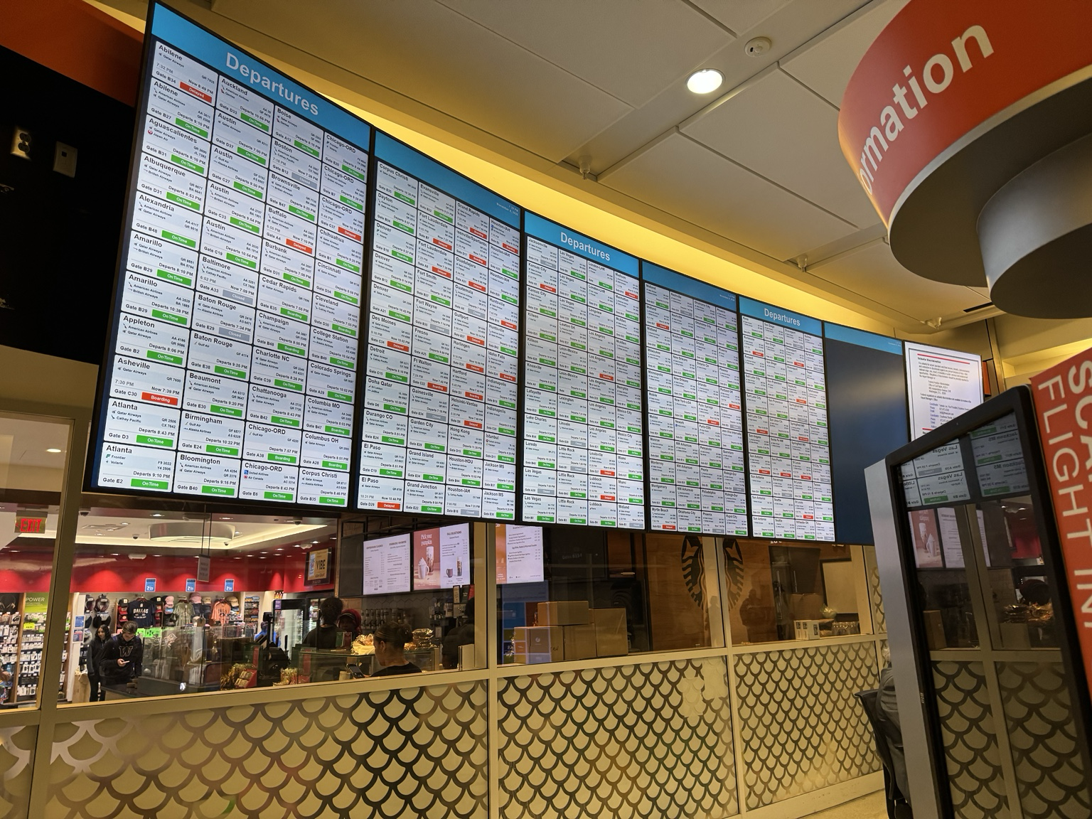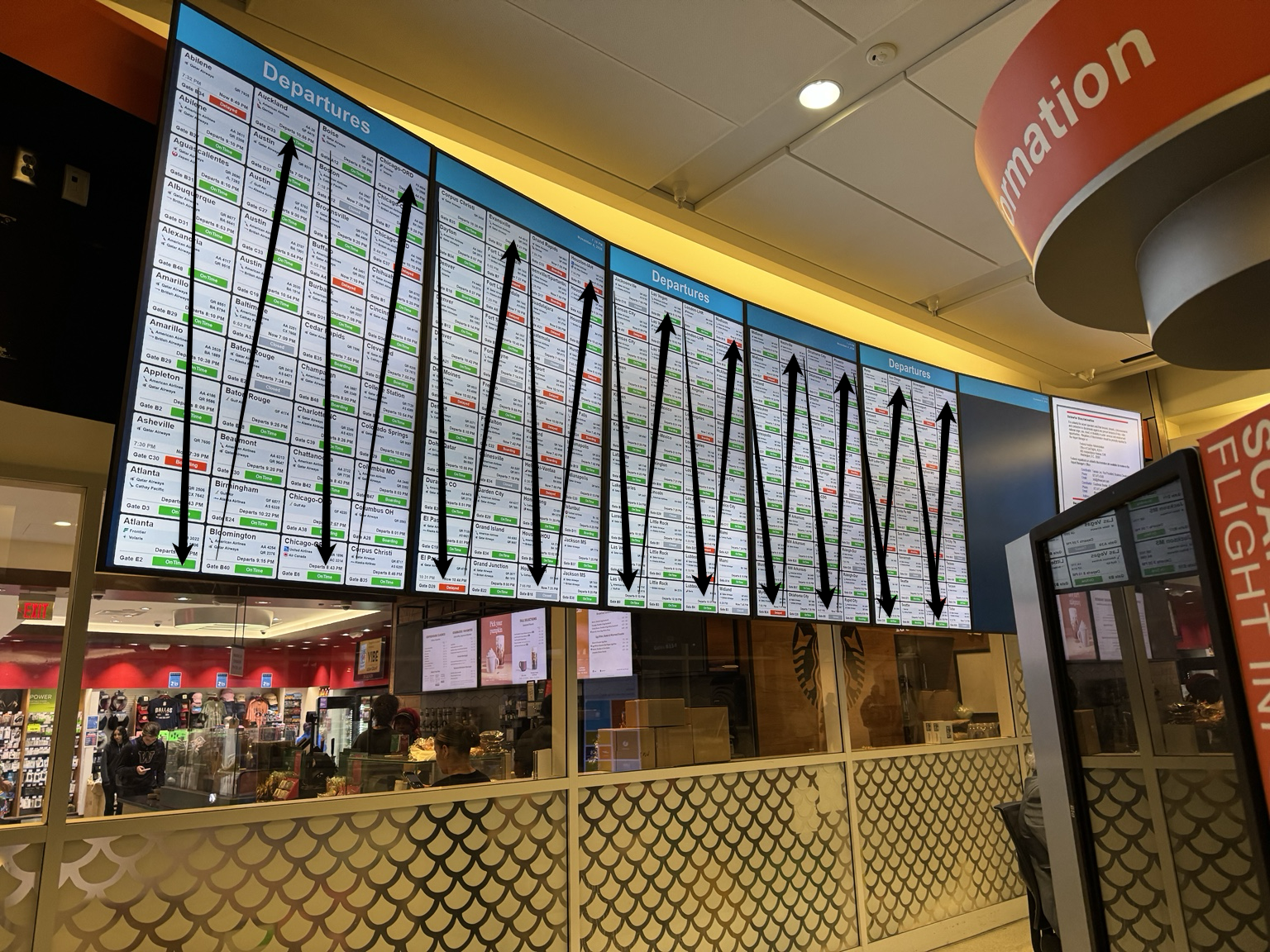
HEY 👋 SICILY AIRPORT TEAM PLEASE USE THIS PROMPT TO MAKE IT LOOK LIKE “NOT VIBE CODED”
@ItalyMFA
‘Redesign my entire website to look like a premium, professionally crafted website built by an experienced product designer and senior frontend engineer.
The goal: Make the website feel intentional, polished, unique, and production ready. It should NOT look AI generated, template based, generic, or vibe coded.
Follow these guidelines carefully:
1. Visual Identity
• Create a strong and consistent visual identity.
• Use a refined color palette with intentional contrast.
• Avoid generic AI gradients, excessive glassmorphism, glowing effects, and random accent colors.
• Use sophisticated typography with a clear hierarchy.
• Establish consistent spacing, alignment, and proportions.
• Make every section feel deliberately designed.
2. Layout and Composition
• Avoid repetitive layouts where every section looks like the same card grid.
• Use interesting visual compositions, asymmetrical layouts, and balanced whitespace.
• Create natural transitions between sections.
• Avoid unnecessary containers, borders, shadows, and rounded cards.
• Make the page feel editorial, modern, and thoughtfully structured.
3. Typography
• Use professional typography with carefully selected font pairings.
• Establish clear differences between headings, subheadings, body text, and labels.
• Avoid oversized headings just for visual impact.
• Pay attention to line height, letter spacing, and text width.
• Make text easy and comfortable to read.
4. Components and Details
• Redesign buttons, navigation, forms, menus, and interactive elements.
• Use subtle, sophisticated hover states.
• Keep border radiuses consistent.
• Use shadows sparingly and only when they add depth.
• Ensure icons have a consistent visual style and size.
• Remove unnecessary decorative elements.
5. Animations and Interactions
• Add subtle, purposeful animations.
• Use smooth transitions and refined microinteractions.
• Avoid excessive animations, bouncing elements, and distracting effects.
• Make interactions feel responsive and natural.
• Respect reduced motion preferences.
6. Professional Quality
• Make the website feel like a real product from a funded startup or established design studio.
• Take inspiration from the design quality of Linear, Stripe, Framer, Raycast, and carefully designed Awwwards websites.
• Do not copy their layouts. Use them as references for quality and attention to detail.
• Eliminate anything that feels like a default AI website template.
7. Responsive Design
• Perfect the experience on desktop, tablet, and mobile.
• Ensure spacing, typography, navigation, and components adapt naturally to every screen size.
• Avoid broken layouts, awkward wrapping, and horizontal overflow.
8. Important Implementation Rules
• Preserve the existing website’s functionality, features, content, and integrations.
• Do not remove working components just to simplify the design.
• Reuse the existing technology stack.
• Write clean, maintainable, production quality code.
• Avoid unnecessary dependencies.
• Fix existing visual inconsistencies and layout issues.
• Ensure accessibility and good performance.
Final Instruction
Do not simply change colors, fonts, or border radiuses. Rethink the entire visual experience.
Act like a world class creative director reviewing a mediocre website. Identify everything that makes it look generic, amateur, or AI generated, and replace those elements with thoughtful design decisions.
The final result should look like someone spent weeks refining the design, not like someone generated a website in 30 seconds.
Be opinionated. Pay attention to the smallest details. Prioritize design quality over flashy effects.’