Games IHG
I was contacted by the design agency V09 to help them create a new digital solution for their client. I also been helping IHG for different design projects for the last 5 years. I know them very well, I’ve been in their offices many times and that familiarity from both sides helped to have a smooth process.
V09 had some ideas but they were not sure if they were possible, they wanted a personalized game but the budget didn’t allow them to consider developing a native app/game. I sit with them to brainstorm different ways to do it.
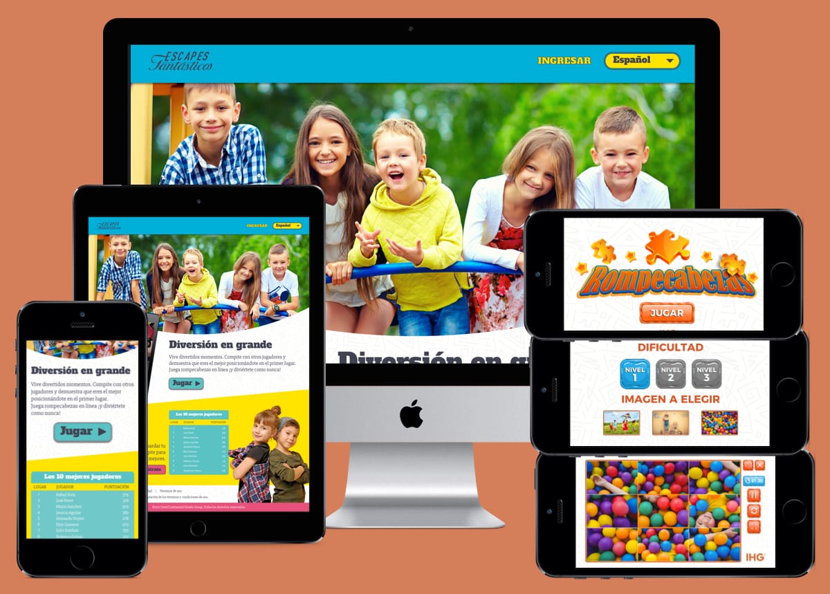
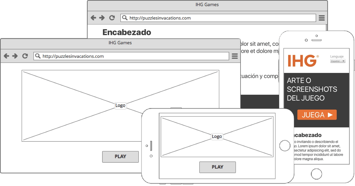
We came out with the solution to embed a personalized HTML5 game, I made a responsive website so any visitor can play in any device and have a similar feel of a native app, it was less expensive and easier to make changes and adapt to other languages.
Another advantage of building it in HTML5 is his flexibility. Campaigns change very often, four or five in a year. It would be very time consuming and expensive to rebuild the game every new image that they want to promote. But with technologies like HTML, CSS and Javascript we got a very straightforward workflow to change the look of the game. Replacing images in the assets/img folder and maybe tweak a couple of colors on the CSS and thats it. Fast and inexpensive.
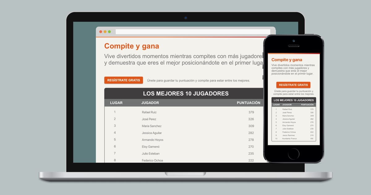
Now, we a have a very simple game. We didn’t wanted to be used once so they would easily past the three levels and leave. Without seeing a reason to return and play again. It needed something else to hook the players so we added a leaderboard. A proven way to encourage competitiveness and have people playing more trying to be on the top.
One of the challenges was to get kids to use it and if the average adult attention span in the web is around 6 sec. We needed a easy to understand site, with a clear and fast way to start playing.
Early in the planning we knew it would be in three languages (English, Spanish and Portuguese). The idea was to focus heavily on the UX and the site logic. We don’t want to change the layout or have problems with the space when translations in other languages are a lot longer or shorter. It should feel natural, see things when you already expected to see them. Had clear icons to save translations nightmares and make the base site easy to translate without worrying with inconsistencies in the design.
And of course, being for kids, it needed colors. This time the team from V09 was responsible of adding more life the site, dressing it with a colorful and funky design that gave a fun and welcoming look and feel.